 |
May 2004
|
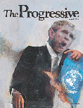
"This cover was illustrated by David
Brinley, who is one of my favorite artists to work with. The
cover story was about Bush's foreign policy and how it is making the
world less safe. We came up with a simple concept of Bush dropping a
globe. This was the first cover Brinley did for us, and his
initial sketch was a very deformed, maniacal-looking Bush smashing the
globe into the ground. I think he was giving us what he thought a
political magazine would want: caricature. But I thought that
really undermined the gravity of the article and could make it look to
some like just another liberal screed. So I asked him to try it
in his more traditional style, and I think it worked much more
successfully. It's a lot more subtle, and Bush's expression
really communicates the point of the piece. Some people on staff
didn't think it was dynamic enough and that the color pallet was too
somber, but it turned out to be one of our best-selling covers on the
newsstand last year." -Aaron
Morales, The American Prospect
(Feb. 2, 2005
e-mail)
|
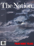
Nov. 22, 2004
|
This was the most nerve-wracking cover, not only because we were all apoplectic about the election but because the magazine would be going to press the day after election and we had to propose a separate solution for three likely scenarios: 1) Bush wins outright; 2) Kerry wins outright; 3) the winner is still unknown as of the drop-dead deadline. We met in Katrina's office with all the players, I think it was Friday before the election, but all we really agreed upon then and there was that the feeling for a Bush victory scenario should be "dark." But I had a reliable source at the DNC, whom we did some work for, and by Monday I was getting the same euphoric polling data that duped the Kerry folks into thinking they were going to win, and it duped me, too. So as of Monday we were focusing mostly on the "Kerry wins" scenario. ...Stephen's solution: Kerry as the bloodied, battered heavyweight survivor of a brutal 15-round decision. And we loved it. But the magazine didn't. And anyway, of course, by midnight Tuesday we were back to the "Dark" scenario, which ran." -Gene Case and
Stephen Kling, The Nation
(Feb. 3, 2005
e-mail)
|
 March 22,
2004
|
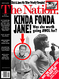
People loved George & Jane. The idea came from the magazine, maybe even from Tom Hayden, Jane's ex-husband of course, and a member of the Editorial Board. (I hope he cleared it with her!) We just sort of "followed the concept out the window," putting Ashcroft, Gingrich in Jane's arms, too, inside the magazine. -Gene Case and
Stephen Kling, The Nation
(Feb. 3, 2005
e-mail)
Note:
An authentic photo showing Fonda and Kerry sitting separately in the audience at an anti-war rally in Valley Forge, Penn. on Labor Day 1970 appeared on the NewsMax.com website on Feb. 9, 2004. Several days later a faked image, purportedly showing Kerry standing by while Fonda spoke at a rally, made the rounds on the Internet. The faked image, which bore the caption "Actress And Anti-War Activist Jane Fonda Speaks to a crowd of Vietnam Veterans as Activist and Former Vietnam Vet John Kerry (LEFT) listens and prepares to speak next concerning the war in Vietnam (AP Photo)," consisted of two Corbis photos from different events merged together. |
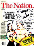 Jan. 26,
2004
|
At this point--the second week in January, 04--everyone was still expecting Howard Dean to win Iowa and New Hampshire. The cover story postulated a sort f sexual-dynamic basis for his popularity: Dean was the only Democrat who was man enough to stand up to bully Bush. Our instinct was to go back to childhood, to the old body-builder ads in which the skinny "girly man" (the Democratic Party) gets sand kicked in his face and then transforms himself into a real man. The plot line fit nicely, with the admiring pin-up in the background cooing, "And Democrats used to be such sissies!" -Gene Case and
Stephen Kling, The Nation
(Feb. 3, 2005
e-mail)
|
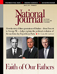
July 21, 2001
|
The cover of the three Bush's ("Faith of Our Fathers")
attracted a lot of interest, where the layout helped reinforce the
message. The images were specifically selected to look as
identical to one another as possible. [Photos: U.S. Senate Historical Office; Richard A.
Bloom; Reuters/Larry Downing]
-Jan Zimmeck, National
Journal (Jan. 27, 2005
e-mail)
|
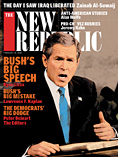
Feb. 10, 2003
|
We
knew we were obligated to use a wire photo because we wanted a shot of
Bush from the '03 State of the Union. Given that, newspapers
everywhere, and possibly the news weeklies, would be drawing from the
same pool, muddling any distinction for our coverage of the
event. In addition, file photos can be extremely dry on a cover. Illustration wasn't considered because it would not have had the immediacy and impact this topic required. The magazine supports Bush's position on Iraq and knew that would be central to his speech and so the editors did not want to portray him negatively. Time was another factor since the speech was Tuesday night and the magazine ships Wednesday night. So finding a stylizing a strong file photo was clearly the solution. -Joe Heroun, The
New Republic (Feb. 6, 2003
e-mail)
|
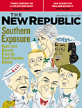
June 19, 2003
|
The
artist for this week's cover is Zach
Trenholm from San Francisco. He gained notoriety doing
caricatures for the defunct website Suck.com and I've worked with him a
number of times previously. Over the past couple of years he's
done a number of satirical portraits for the Books & Arts section
of TNR. The cover was intended to suggest that the Dems first big gathering of '04 candidates was a lightweight affiar and that they were pandering to their Southern hosts, hence the oldboy Seersucker suits and mint juleps. Zach's style was perfect to set the sarcastic tone. Nine figures were too much to cram onto the cover so we decided to edit out those candidates considered less formidable and which didn't play prominently inside. We included Sharpton for mainly comic value. The piece ran as submitted on the first draft. -Joe Heroun, The
New Republic (May 2003
e-mail)
|
 November 2002 |
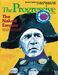
I came up with this concept after looking at how past leaders have been portrayed in the propaganda of their enemies. In the first half of the twentieth century Napoleon was good shorthand for an out-of-control military leader, and while his image doesn't have quite the same resonance today, I still thought it would be a good way to show Bush's ambition for empire. Andrea Ventura did the artwork - he's a wonderful artist whose work I first noticed years ago in Rolling Stone. He has a knack for capturing people's personalities (especially in facial expression) and a real flare for color. This was the first piece he did for our magazine - and its been one of our most popular covers ever. -Nick Jehlen, The
Progressive (April 2, 2003
e-mail)
|
April 2003
|
David Hollenbach, the artist, came up with this concept. I felt it was a great idea - simple and clean, and getting the point across with a bit of a twist on the flag we're used to seeing in this situation. David's art, a collage of photos and paint, always captures emotion and movement in an interesting way. An interesting side note on this cover. The same week it appeared a very similar concept came out on the cover of In These Times, the Chicago-based magazine. Their cover was simply a UN flag burning. -Nick Jehlen, The
Progressive (April 2, 2003
e-mail)
|
Oct. 30, 2004
|
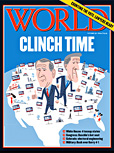
The Oct. 30, 2004 cover of WORLD ("Clinch time") was an attempt to add a little levity in the midst of a heated presidential campaign season. Plus we had been doing so much political coverage, with photo covers of both Bush and Kerry, that we really did not want to use another photo of either them. (We also knew one of them would be pictured on the cover again in two weeks.) So we turned to Krieg Barrie, our staff illustrator (he also does freelance work) who lives near Seattle. Often we will give him complete freedom on illustrations, but this time the editors and I gave some direction concerning the elements we were looking for, namely a U.S. map with Bush and Kerry signs in areas of the country reflecting their support. We suggested a few landmarks, but he took it from there, adding the creativity and cleverness. After an initial rough draft, we nailed down the elements, then he emailed us a finished Illustrator file. The likenesses of Kerry and Bush needed some refining, and after several tweaks he sent us the final version. -David Freeland, WORLD
(Feb. 4, 2005
e-mail)
|